Canon EOS 7D MK II
Canon EOS 60D
Canon 100-400mm IS II USM L series lens for wildlife
Canon 24-105mm IS USM L series lens for everyday use
Canon 17-55mm F/2.8 IS USM lens for wide angle landscapes and low light use
Canon 10-18mm F/4.5 IS STM ultra wide angle lens for landscapes
Speedlite flash unit and a 1m chord for off camera flash (OCF) with ETTL metering capability.
Radio transceivers for OCF
Tripod and cable release for keeping it still
Cokin filters (square) and a holder. Various strengths of graduated neutral density filters are a must for landscape work.
Filters (round screw on), including polarizing, ultra violet and neutral density
Spare batteries and SD Cards
Cleaning cloths and a small blower
LowePro 302 AW camera bag to stash it all in
Beware - the bag gets heavy after an hour or so. Often I cut back to the 'bare essentials' depending on what I'm doing
Opteka MCH-25 camera harness. This is a brilliant piece of kit and makes carrying a camera effortless and takes away neck ache
Small HD video camera with a monopod to hold it on, even in the vehicle. It's extremely difficult to hold it steady with your arms outstretched
The video has a wind suppressor on the microphone
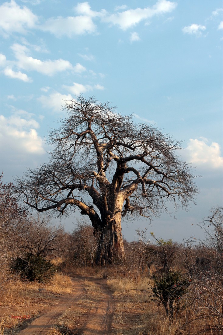
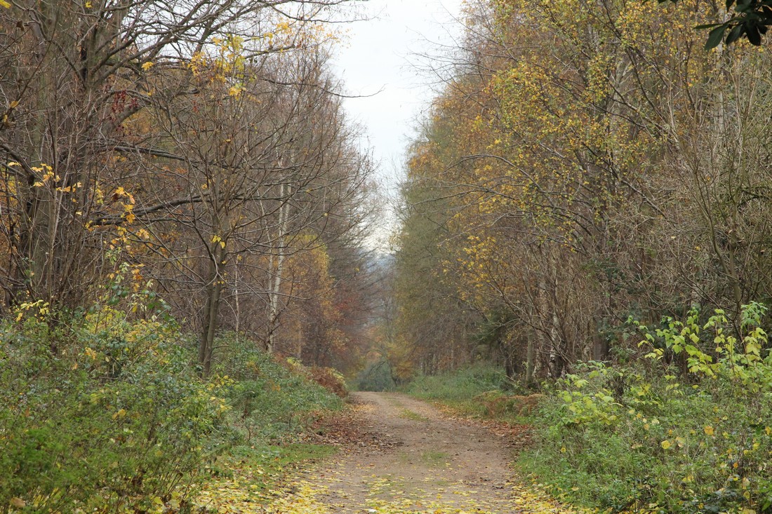
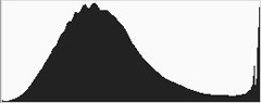
A baobab catches the late afternoon sunshine in Ruaha
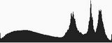
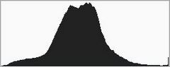
Despite the spikes toward the right ( baobab above) - which correlate to bright spots on the tree, the track and the white of the clouds - this curve contains data across all of the tonal range and is absolutely fine, although it could possibly have been lightened a little as a small amount of data appears to have been lost at the left. However your eye has to make the final call
A histogram is a graphical representation of the distribution of numerical data. In the photographic sense it shows the range of tones between black and white.
What does a histogram tell us?
It tells us whether or not our image is over or underexposed, or bang on the mark. It also tells us the relative distribution of tones from dark at the left of the histogram, all the way through the mid tones to light, at the right. It can be displayed on the camera for each image as it is taken.
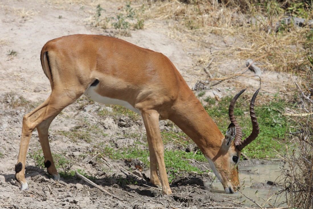
Impala at a waterhole
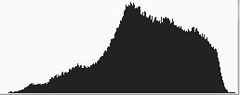
This is an almost ideal histogram. There is
data present all the way to the left and
right, indicating that a full range of tones
are present from black to white. The relative
height of each part of the curve represents
the amount of the particular tone that is
present
If it is set to display individual colour curves it will show the amounts of red, green and blue (the primaries) within the image. The shape of the curve is not critical. What matters is the spread of the tones. Ideally tones should be present all the way across the range.
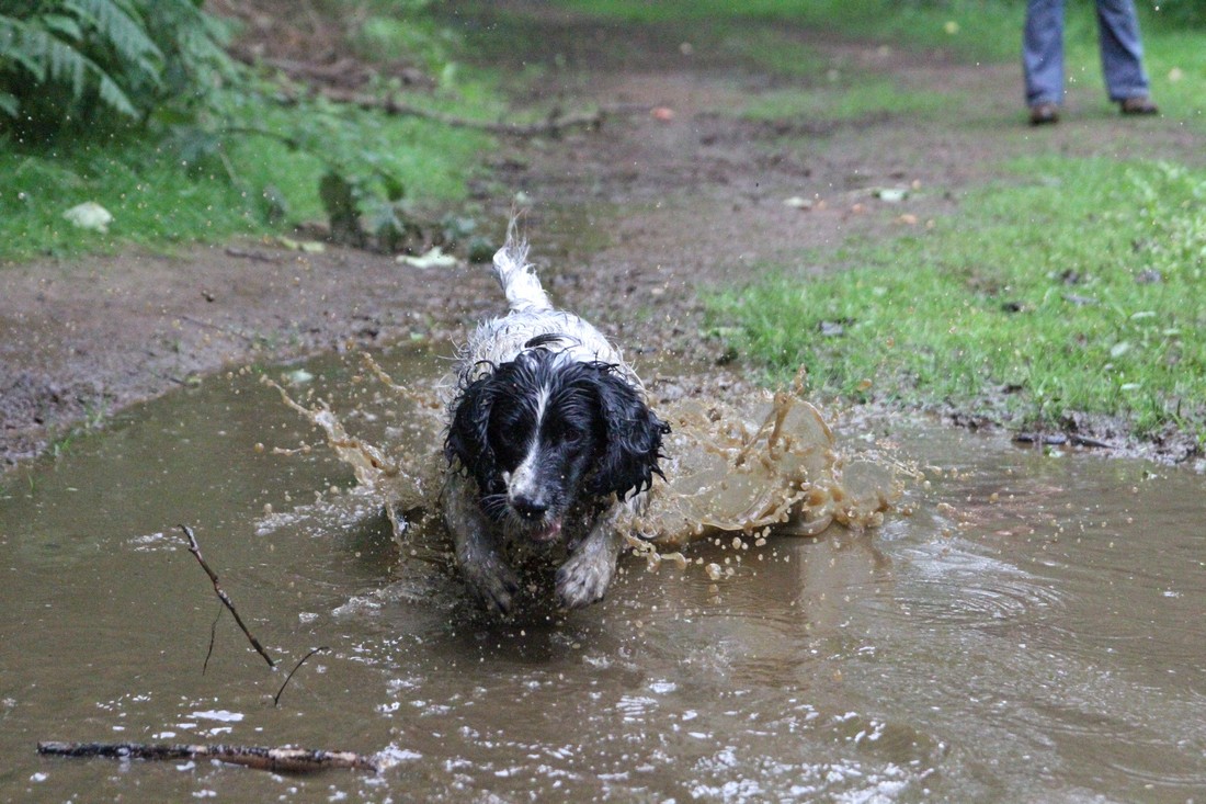
My dog having a great time
The photo appears a little underexposed as
there is a gap to the right indicating no
very light tones - except for a tiny spike far
right. However, when I attempted to correct
it in photoshop by adjusting the light levels
it blew out the detail in the dog's white
tail. Therefore I chose to leave it as it was
If there is a gap at the right hand side there are no tones in the lightest part of the range present and it suggests that the image is underexposed. I say suggests, because your intent may have been to deliberately darken the image.
If there is a gap at the left then there are no tones present at the darkest part of the range and the image contrast will probably be too low.
If there is a peak right up to either edge of the graph then it shows that some of the tones present were outside the range of the sensor to capture them and have been lost. At the right hand edge this indicates an overexposed picture with blown out highlights, and conversely at the left it suggests too much black and underexposure. This is known as clipping, and one way to combat it is to turn on the clipping warning 'blinkies' on the camera display screen settings. Any part of an image with blown out areas will then flash on the camera display screen and you can adjust your settings and try the shot again.
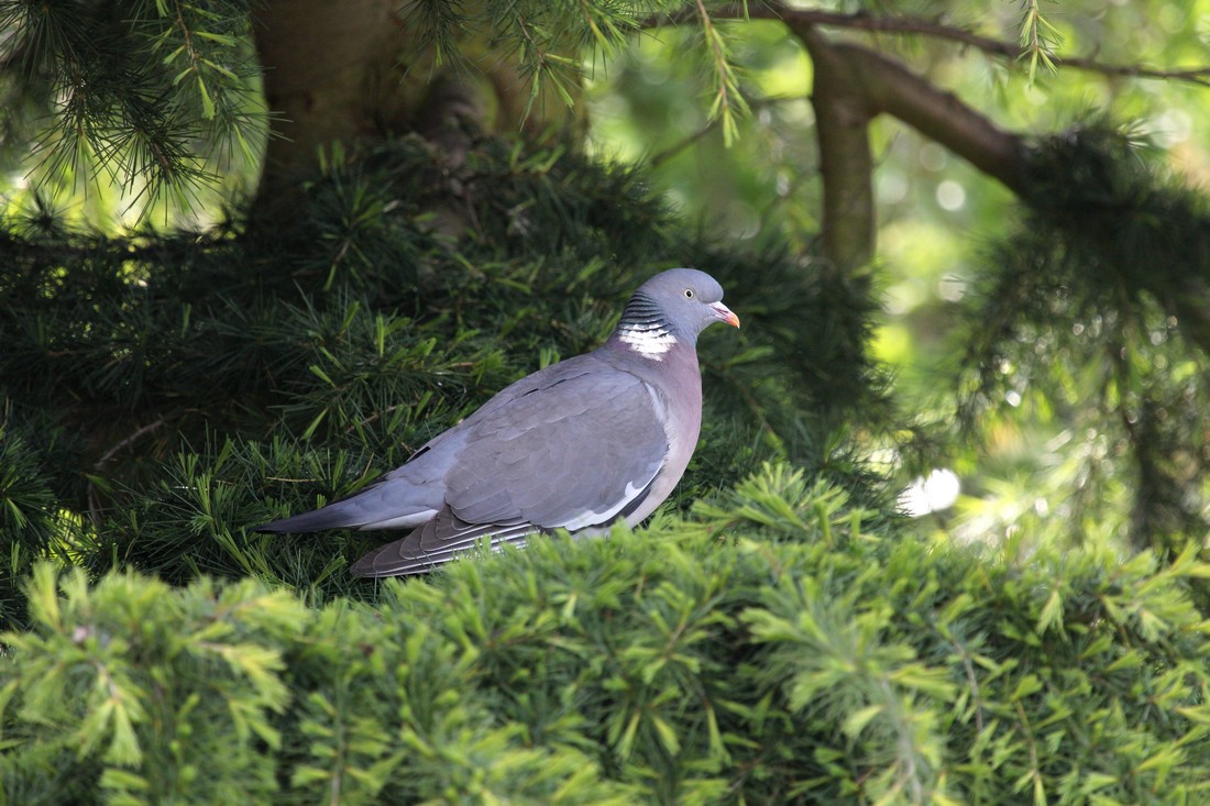
Wood pigeon in fir tree
There are a lot of tones to the left of the
histogram but if you look at the photo of
the pigeon you can see that there are a lot
of dark tones in it and and very little light
tones. This is perfectly acceptable
The distribution of the tones may be skewed, but this will depend on the subject of the image. A photo with a lot of dark tones may look like this, but this is perfectly acceptable as long as the full range from dark to light has some representation, and nothing is clipped. Similarly, a light subject may be skewed to the right. You can compare the histogram to the image and judge for yourself whether the distribution looks acceptable.
To compensate for under or over exposure, assuming you are using aperture priority or shutter priority, where the camera has automatically set the metering, use the exposure compensation feature which gives you the ability to manually override and adjust the camera's setting.
In full manual then simply adjust the shutter speed or aperture to suit.
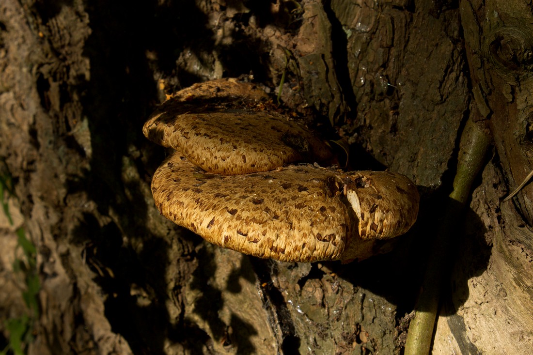
Fungi on tree bark
There are a lot dark of tones piled up at the left
of the histogram which indicates underexposure
and a lot of data has been lost to black. However,
in this instance the photo still seems to work
and so it is no problem from an aesthetic point
of view
Don't go by what the image looks like on the camera display screen. The brightness of this screen is not a true reflection of how bright or dark the image will be in print.
Some lenses will have tendency to over or underexpose images. For instance my 100-400mm lens usually results in the image being under exposed by about 1/3 of a stop. So it's best to set exposure compensation to +1/3 before I even start. Less image data will be lost that way and final adjustments can be made in post production editing.
Roll your mouse over this photo to see that
the light levels have been edited in Photoshop
to cover the gap to the left of the histogram
which was a result of over exposure. The
darker tones have been darkened further to
extend the tonal range. The top histogram
shows the original tones and corresponds to
the lighter picture here.
The bottom histogram shows the tonal range
after adjustment to darken the image and
improve the contrast. Click on the image to
see it full size
Most of the tones are to the right which
indicates over exposure. There is a gap to the
left showing a lack of dark tones which will also
reduce the contrast
Histograms can be various odd shapes but as long as tones cover the full range they should be perfectly fine.
Pictures with reduced tonal range may look dull and washed out with low contrast.
The dark tones have been adjusted to cover the
whole range, which improves the colour and also
the contrast. The gaps are due to the adjustment
process
A tip is to shoot in RAW as the RAW file editors generally make it really easy to expand or contract the tonal range if necessary. Also RAW files contain more information than JPGs especially at each end of the range and so if more information can be recovered then it can improve the quality of the final JPEG image.
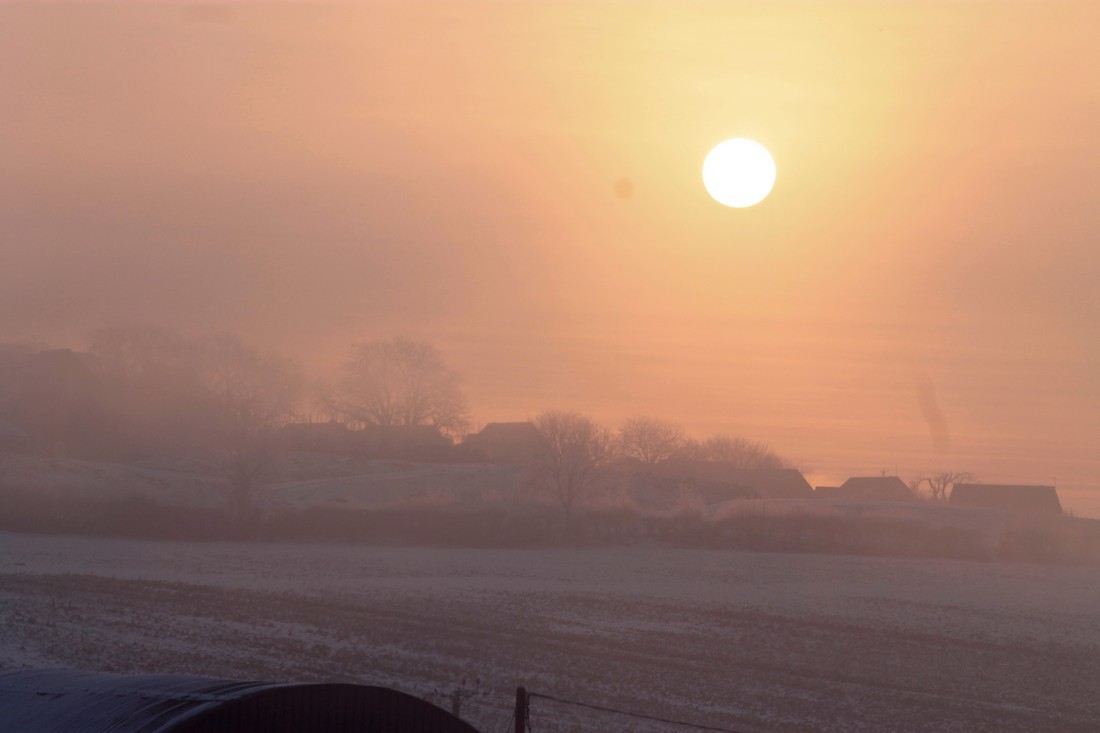
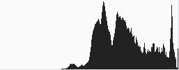
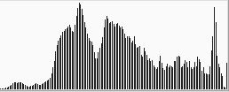
Here the tonal range is very wide due to the
lightness of the sky in comparison to the rest
of the photo. I have exposed the shot for the
trees which means that without the use of a
filter the sky becomes blown out, as the tonal
range is more than the dynamic range of the
camera sensor
This histogram has well distributed tones
but there is a high peak at the very right.
This is due to the almost white sky and some
data has been lost. Decreasing the exposure
would recover it but the rest of the image
would then be too dark
If the tonal range of the image is greater than that which the sensor can capture due to limits on its dynamic range, then you have to adopt strategies to decease that tonal range. It may be possible to light the dark parts of the image with fill flash, or if a sky is being blown out then use a graduated Neutral density filter to darken the sky and pull its tones into range.
Once tones are completely blown out then there is no information to recover and those tones are lost forever.
It is always best to correct these problems in the field as it will result in more information being present in the image and reduce the time needed to spend editing.
You do not have to be a slave to the histogram. Sometimes your intent overides what the camera decides is right. In snow for instance you will nearly always have to increase exposure compensation by up to 2 stops or it will looked washed out. (Remember the camera would like the world to be mid grey).
Sometimes a photo just looks better at a different exposure setting from what the camera suggests. You have the final say.